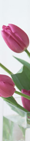
 Gift Shop
10枚にスライスした画像を並べる + リンクを作る


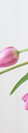
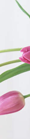
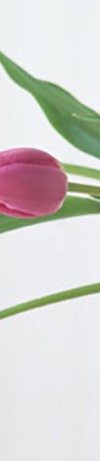
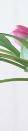

スライスした画像は 100px × 461px になっています。
CSS/画像を10枚並べると1000pxになるので、containerのサイズを変更してください。(padding分80pxをプラス)
max-width: 1000px; → max-width: 1080px;
CSS 写真を横に並べるためのボックスを作る
.photo {
display: flex;
justify-content: flex-start;
}
CSS マウスオーバーした時に画像を明るくする
a:hover img {
filter: alpha(opacity=70);
-moz-opacity: 0.6;
opacity: 0.6;
}
HTML
<div class="photo">
<a href="index.html"><img src="img2/p01.jpg" alt=""></a>
<a href="index.html"><img src="img2/p02.jpg" alt=""></a>
<a href="index.html"><img src="img2/p03.jpg" alt=""></a>
<a href="index.html"><img src="img2/p04.jpg" alt=""></a>
<a href="index.html"><img src="img2/p05.jpg" alt=""></a>
<a href="index.html"><img src="img2/p06.jpg" alt=""></a>
<a href="index.html"><img src="img2/p07.jpg" alt=""></a>
<a href="index.html"><img src="img2/p08.jpg" alt=""></a>
<a href="index.html"><img src="img2/p09.jpg" alt=""></a>
<a href="index.html"><img src="img2/p10.jpg" alt=""></a>
</div>
上記の画像にマウスオーバーエフェクト
CSS マウスオーバーした時に画像を大きくする
.mo8{
width: 100px;
height: auto;
overflow: hidden;
cursor: pointer;
}
.mo8 img{
width: 100%;
transition-duration: 0.5s;
}
.mo8:hover img{
transform: scale(1.2);
transition-duration: 0.5s;
}
HTML
<div class="photo">
<div class="mo8"><a href="index.html"><img src="img2/p01.jpg" alt=""></a></div>
<div class="mo8"><a href="index.html"><img src="img2/p02.jpg" alt=""></a></div>
<div class="mo8"><a href="index.html"><img src="img2/p03.jpg" alt=""></a></div>
<div class="mo8"><a href="index.html"><img src="img2/p04.jpg" alt=""></a></div>
<div class="mo8"><a href="index.html"><img src="img2/p05.jpg" alt=""></a></div>
<div class="mo8"><a href="index.html"><img src="img2/p06.jpg" alt=""></a></div>
<div class="mo8"><a href="index.html"><img src="img2/p07.jpg" alt=""></a></div>
<div class="mo8"><a href="index.html"><img src="img2/p08.jpg" alt=""></a></div>
<div class="mo8"><a href="index.html"><img src="img2/p09.jpg" alt=""></a></div>
<div class="mo8"><a href="index.html"><img src="img2/p10.jpg" alt=""></a></div>
</div>
フロートした画像にマウスオーバーエフェクトしたい場合
上記右側の画像をマウスオーバーで画像を拡大したい場合のコードは以下の通りです。
CSS/画像のサイズは実際のサイズを入力してください。
width: 250px;
height: 180px;
贈り物にぴったりの商品です。

テキストテキストテキストテキストテキストテキストテキストテキストテキストテキストテキストテキストテキストテキストテキストテキストテキストテキストテキストテキストテキストテキストテキストテキストテキストテキストテキストテキストテキストテキストテキストテキストテキスト テキストテキストテキストテキストテキストテキストテキストテキスト テキストテキストテキストテキストテキストテキストテキストテキスト テキストテキストテキストテキストテキストテキストテキストテキスト テキストテキストテキストテキストテキストテキストテキストテキスト テキストテキストテキストテキストテキストテキストテキストテキスト テキストテキストテキストテキストテキストテキストテキストテキスト テキストテキストテキストテキストテキストテキストテキストテキスト テキストテキストテキストテキストテキストテキストテキストテキスト テキストテキストテキストテキストテキストテキストテキストテキスト テキストテキストテキストテキストテキストテキストテキストテキスト 。
CSS
.mo1{
width: 250px;
height: 180px;
overflow: hidden;
cursor: pointer;
margin:0 0 25px 25px;
float:right;
}
.mo1 img{
width: 100%;
transition-duration: 0.5s;
}
.mo1:hover img{
transform: scale(1.2);
transition-duration: 0.5s;
}
@media only screen and (max-width:767px){
.mo1{
float:none;
}
}
HTML
<p class="pink">贈り物にぴったりの商品です。</p>
<p class="mo1"><img src="images/gift.jpg" alt=""></p>
<p>テキストテキストテキストテキストテキストテキストテキストテキストテキストテキストテキ~</p>